UX/UI Case Study
Revamping Tribal Help Access
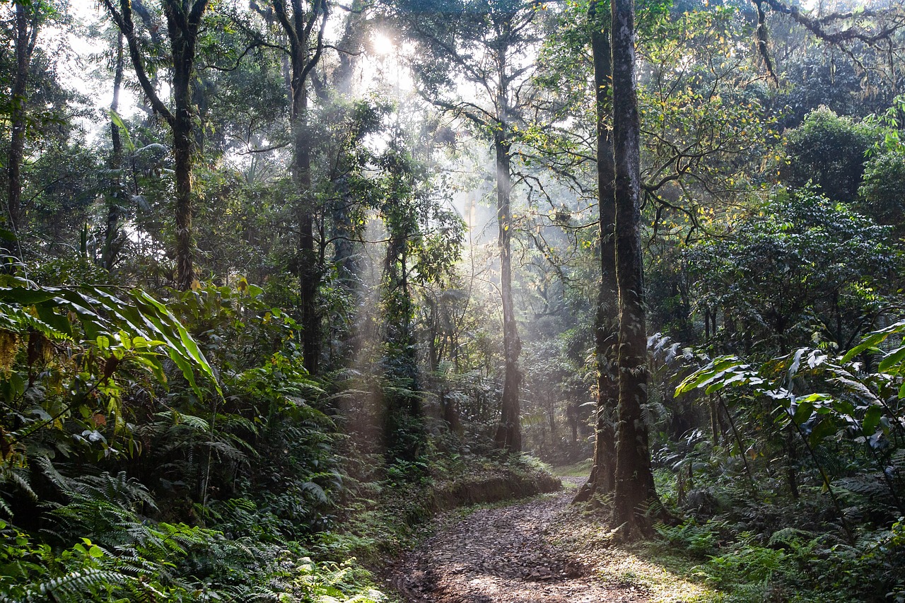
Designing an inclusive mobile experience to help rural citizens easily discover and apply for government schemes in Odisha.
Project Overview
Duis aute irure dolor in reprehenderit in voluptate velit esse cillum dolore eu fugiat nulla pariatur.
Ut enim ad minim veniam, quis nostrud exercitation ullamco laboris nisi ut aliquip ex ea commodo consequat.
Lorem ipsum dolor sit amet consectetur adipiscing elit. Dignissimos laudantium fuga molestiae, aut eius minus reprehenderit.
Excepteur sint occaecat cupidatat non proident, sunt in culpa qui officia deserunt mollit anim id est laborum.
Project Type : Graphic Design
Client : Juwel Khan
Duration : 2 Weeks
Task : UI/UX, Frontend
Budget : $2000
Research Goals
"We want to investigate how people interact with NGO websites focused on forest conservation and women’s financial safety, so that we can understand how donors, volunteers, and beneficiaries navigate the platform, engage with content, and complete key actions like donations, volunteering, or financial aid applications."
Discovery (Understanding the Existing System)
Research Methods Used
- Interviews with local residents and volunteers
- Competitive analysis of NGO platforms
- Usability testing with prototypes
- Online surveys on forest conservation & tribal issues
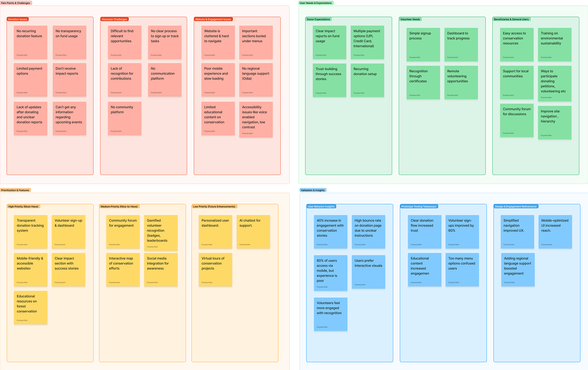
Affinity Mapping
Synthesized insights from 20 interviews & surveys across donor and beneficiary segments.
- Pain Points → Drop-offs, accessibility friction
- User Needs → Trust, transparency, fast action
- Feature Prioritization → Mapped by need clusters
- Behavioral Insight → From navigation and donation flows
Competitive Audit & UX Challenges
I audited top NGO platforms (WWF, GiveIndia, CRY, etc.) to evaluate their UX patterns, accessibility gaps, and donation flows. These insights shaped our redesign to better support transparency, action, and trust.
- Navigation: Confusing menus, missing donation prompts.
- Accessibility: Low contrast, unreadable text on images.
- CTA Placement: Weak visibility, low hierarchy, unclear outcomes.
- Donation Journey: Too many steps, unclear value proposition.
- Mobile Experience: Poor responsiveness, overflow issues.
Research (Understanding Users & Their Needs)
User Personas
I developed personas based on research insights to capture the goals, behaviors, and frustrations of real users. These guided the design toward solving the right problems.
Ramesh Shah
38 y/o · Donor · Mumbai
Bio: A senior software engineer passionate about forest preservation. Regular donor to climate and tribal welfare NGOs.
Goals: Support trusted causes, track donation impact
Pain Points: Complex donation flow, lack of fund transparency
Design Needs: Easy-to-use donation flow, clear reporting
Quote: "I want to donate regularly, but I need to see where my money goes."
Sunita Devi
44 y/o · Beneficiary · Rural Odisha
Bio: A single mother in a tribal village looking for livelihood and education support for her daughters.
Goals: Access financial help, secure education for kids
Pain Points: Unclear forms, poor access on mobile
Design Needs: Mobile-friendly design, simple local language support
Quote: "I just want to know if I’m eligible and how to get help."
Amit Verma
26 y/o · Volunteer · Bhubaneswar
Bio: A college student who volunteers for social causes on weekends. Tech-savvy and active on social media.
Goals: Easily find volunteering opportunities
Pain Points: Lack of clarity on events, low engagement from admin
Design Needs: Calendar integration, quick registration, notification system
Quote: "If I can find it quickly, I’ll show up and bring friends too."
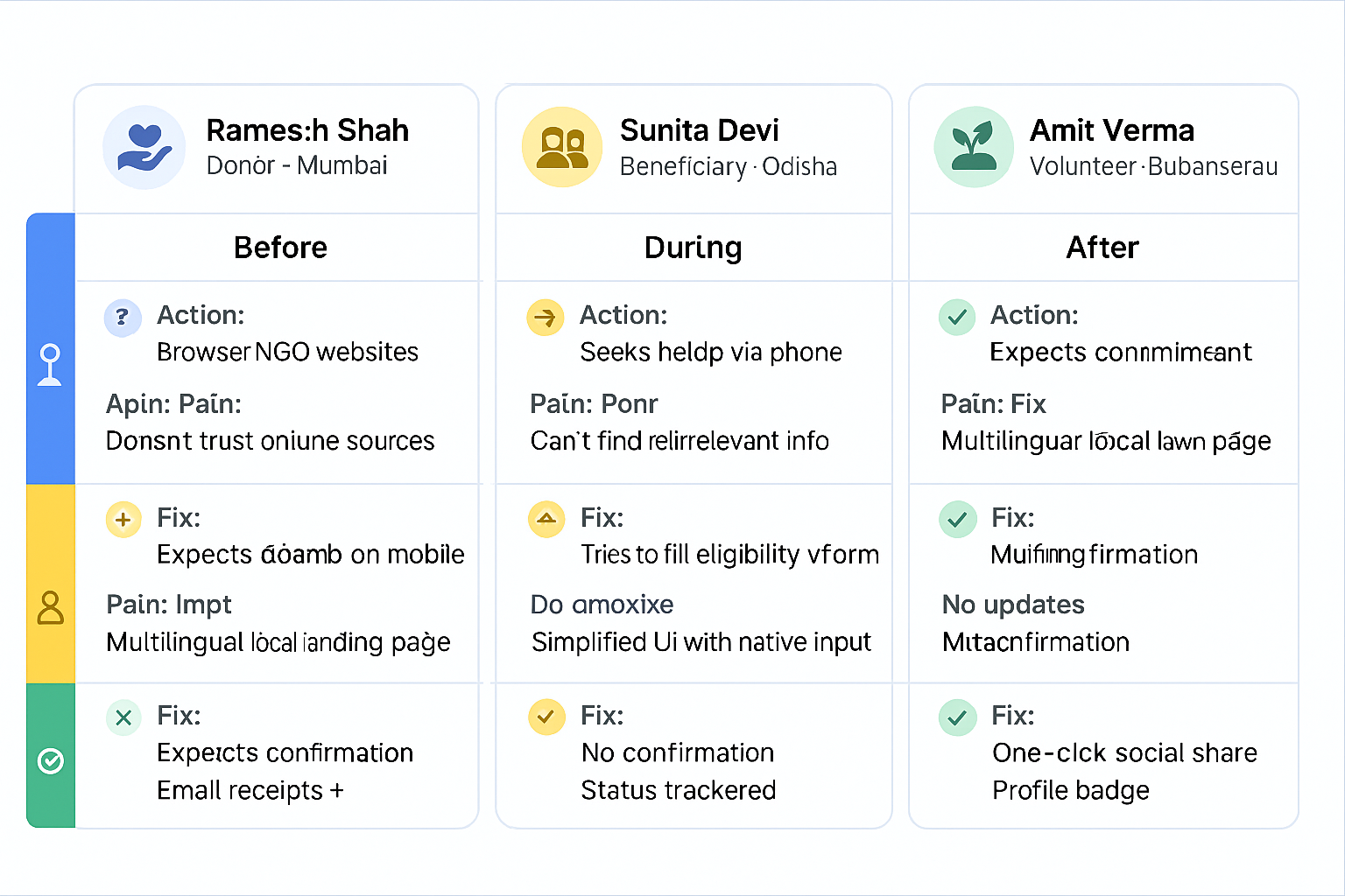
Persona-Specific User Journey Mapping
Mapping each persona’s journey revealed critical friction points and opportunities across touchpoints. These insights helped prioritize UX improvements where they mattered most.
| Persona | Before | During | After |
|---|---|---|---|
| Ramesh Shah Donor · Mumbai |
Action: Browses NGO sites Pain: Unclear impact, trust issues Design Fix: Verified badges, real-time updates |
Action: Begins donation on mobile Pain: Long form, poor mobile UX Design Fix: Autofill, mobile-first form |
Action: Awaits confirmation Pain: No email, impact not shown Design Fix: Instant confirmation, impact dashboard |
| Sunita Devi Beneficiary · Odisha |
Action: Looks for help via phone Pain: Can’t find relevant info Design Fix: Local language landing page |
Action: Tries to fill eligibility form Pain: Confusing, no mobile support Design Fix: Form simplification + mobile access |
Action: Waits for response Pain: No updates or clarity Design Fix: SMS/email updates, visual status tracker |
| Amit Verma Volunteer · Bhubaneswar |
Action: Looks for events nearby Pain: Scattered info, outdated pages Design Fix: Interactive calendar + filters |
Action: Registers to volunteer Pain: No real-time confirmation Design Fix: Auto-confirm + reminders |
Action: Wants to share impact Pain: No easy social sharing Design Fix: One-click share + badges |
How Might We Improve the Website?
- Improve Usability, Accessibility & Relevance → Ensure modern design & mobile responsiveness for all users.
- Enhance Navigation → Restructure menu, clarify page hierarchy.
- Streamline Donation & Volunteering Flow → Boost conversions by reducing friction.
- Empower Women & Tribal Communities → Make resources more visible and multilingual.
- Refine Key Features → Highlight impactful content, remove underperforming ones.
- Foster Engagement → Use interactive tools to involve users and volunteers.
- Encourage Collaboration → Enable info-sharing between NGOs, government, and local groups.
- Raise Awareness → Present stories, forest protection, and impact in an engaging way.
IDEATE (Brainstorming Solutions & UX Strategy)
UX Strategy Focus Areas
Based on user research and business goals, I identified key strategy pillars to guide the redesign. These focus areas helped align user needs with actionable design priorities.
Mobile & Accessibility
- Responsive design for all devices
- Ensure WCAG-compliant color contrast
- Add screen reader & keyboard navigation
Improve Navigation
- Restructure menus for clarity & hierarchy
- Highlight CTAs across all pages
- Group content by user type
Donation & Volunteering
- Simplify donation steps & event signups
- Auto-suggest donation tiers
- Offer event-based donation options and volunteer signup
Women’s Rights Visibility
- Highlight safety guides & legal aid
- Simple access in multiple languages
- Promote local empowerment programs
Community & Impact
- Include real impact stories with photos
- Showcase local success stories
- Use infographics to show forest & tribal reach
Stakeholder Collaboration
- Dashboard for NGO–Govt updates
- Coordinate NGOs, govt agencies & tribal communities
- Forms for support & contribution
Feature Prioritization (MoSCoW Method)
I applied the MoSCoW method to focus on what truly matters—prioritizing features that solve real user problems while staying aligned with project goals.
Must Have
- Donation Flow Redesign
- Mobile Responsive UI
- Clear Navigation Structure
- Accessibility Compliance (WCAG)
Should Have
- Recurring Donation Option
- Event Calendar for Volunteers
- Impact Stories & Testimonials
Could Have
- Live Chat with NGO Staff
- Gamification for Volunteers
- Dark Mode Option
Won’t (For Now)
- Advanced AI Chatbot
- Blockchain Donation Tracker
- Multi-org Collaboration Portal
Information Architecture
I applied the MoSCoW method to focus on what truly matters—prioritizing features that solve real user problems while staying aligned with project goals.
Design Execution (Turning Strategy into Visual Design)
Low-Fidelity Wireframes
Before diving into visual design, I explored layout and flow through low-fidelity wireframes. These sketches helped validate the content hierarchy, navigation, and task structure quickly.
( 📌 Click on any wireframe to view it in full detail. )
.jpg)
Visual Design (Final UI Screens)
After iterating through wireframes and user insights, I designed high-fidelity UI screens that align with user needs, accessibility standards, and the brand’s modern visual language.
(📜 Scroll inside the frame. Tap tabs to switch screens.)
Design System Overview
A well-structured design system was created to ensure consistency, scalability, and a unified brand presence across all screens and devices.
Brand Colour Palette
Typography Guidelines
Type scale, weights, and role mapping for clear hierarchy and responsive scale.
H1 — Display Heading
H2 — Section Heading
H3 — Subheading
H4 — Small Heading
H5 — Card Title
Body / paragraph — 16px / 1.5 line-height for readability.
Caption / Helper — 12px
Iconography Standards
Consistent stroke, corner radius and clear size scale: 16 / 20 / 24 px.
UI Component Library
Buttons
Form Fields
Cards
Layout & Spacing System
8px baseline grid. Use consistent increments for padding, gaps and component sizing.
Accessibility Guidelines
WCAG recommendations, keyboard-first interactions, and screen reader best practices.
- Semantic markup & landmarks
- Minimum contrast: 4.5:1 body, 3:1 large text
- Keyboard focus visible and consistent
Tools Used in Design Execution
From whiteboard to wireframe, tools were carefully chosen to streamline execution, enable collaboration, and ensure visual consistency — with AI accelerating key decisions.
Figma
Wireframing & Prototyping
Uizard AI
Speed up Wireframing
Notion
Documentation & Planning
Miro
Empathy Mapping & IA
Zeplin
Developer Handoff & Collaboration
Design Highlights & Rationale
Each decision in this design was driven by empathy, accessibility, and emotional connection — vital for an NGO platform that relies on user trust and action.
Emotional Design
Emphasized clean structure, emotional imagery, and clear donation CTAs.
Responsive Layout
Simplified flow and layout ensured clarity, tap-friendly areas, and WCAG-friendly color contrast.
Simplified Donation Flow
Reduced steps and distractions in the donation process to build confidence and encourage action.
Design System Use
Created modular components for buttons, forms, and CTAs — ensuring brand consistency and scalability.
Test (Validating & Improving the Experience)
Usability Testing & Refinements
I conducted usability testing with 6 users — including donors, volunteers, and NGO staff — to evaluate clarity, accessibility, and task completion across key flows. Feedback surfaced critical usability issues that guided meaningful design refinements.
Key Findings
- Homepage CTA was overlooked due to low contrast
- Forms felt too long on mobile. Users dropped off midway.
- Calendar confused new users
- Some Icons were unclear
- Donation flow was clear, but users wanted faster confirmation feedback.
Solutions Implemented
- Enhanced CTA contrast and repositioned it for visibility
- Split into two-step layout for mobile ease
- Added guided onboarding
- Added text labels for clarity
- Added a visual confirmation screen with animation after donation.
Key UI Iteration
Finding #1: Users Overlooked the Primary CTA

Finding #1: Simplified Header & CTA
Finding #1: Final Version After Testing
Impact & Key Learnings
The redesign made the website easier to use and helped the organization get better results. Below are the key improvements we achieved and the most important lessons I learned during the project.
- 42% increase in donation conversions within the first month of the redesign.
- 40% drop in form abandonment for volunteers.
- Positive feedback from tribal community members for improved accessibility.
- Improved SEO and organic reach through content structuring and accessibility fixes.
- Validated that simplicity, trust, and clarity drive NGO platform engagement.
So... What Did I Learn?
After countless wireframes, cups of ☕, and a few “why-is-this-not-working?!” moments — this project taught me that users just want clarity, trust, and a smooth ride 🚀. Also, dark buttons get more clicks... who knew?
Tribal Help App
Simplifying scheme access for rural users across Odisha.
UX Strategy
Tribal Help App
Simplifying scheme access for rural users across Odisha.
UX StrategyLike What You See?
Interested in bringing thoughtful UX to your product? Let’s talk.